Website menu design: how to make navigation user-friendly
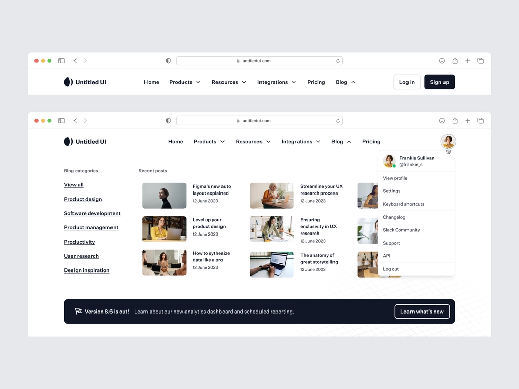
Design is evolving at lightning speed, and if before the menu was always standardized: a static strip with text, when you click on which you go to certain pages, now there is a huge variety of menus and it’s cool! But sometimes the desire to stand out and make the menu creative goes beyond the primary task – ease of navigation for the user.
Site menu is a design element intended for navigation. That is, it should help the user to navigate the site, not confuse him.
Consider the main factors that affect the competent development of the site menu:
By creating menus and designing nesting of pages, you show the user the structure of the site so that he understands the hierarchy. To do this, you need to think through the items: main / secondary / section names, etc. By creating menus and designing nesting of pages, you show the user the structure of the site so that he understands the hierarchy. To do this, you need to think through the items: main / secondary / section names, etc.
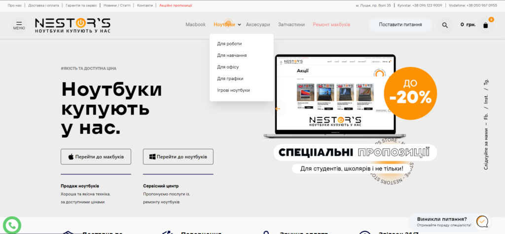
Thanks to this, the user will not get lost and will be able to go to the section of the site of interest in a couple of clicks.
Conversion
Comfortable search for sections and important pages increases the conversion of the site. You can create logic and guide the user the way the company needs, separating important sections of the site from secondary ones. If the user can move freely and comfortably, find the necessary information, he is less likely to leave the site.

SEO-optimization
Navigation is important not only for users but also for search robots. Scanning the site, the robot analyzes its structure. The menu helps it to understand the nesting of pages and their weight. Therefore it is important to develop a menu and optimize it for promotion.
Menu requirements
The task of a marketer, UX/UI designer is to package and launch a new product on the market. In the case of high competition, it is necessary to distinguish the brand among hundreds of similar companies, which is helped by unique design.
A study conducted by KoMarketing showed that 50% of users surveyed during the interview use the navigation menu when getting acquainted with the site, and 37% leave it in the first minutes due to inconvenient navigation. Therefore, creativity is cool, but convenience should be at the heart of the site menu development.
Structure
It is important not to confuse it with the site structure, they are different things. The general structure of the site shows the relationship between blocks and pages: where you can go from and what page. Menu structure – displays navigation on significant pages (rarely on blocks, for example, on a landing page).
That is, basically, navigation is built on transit pages, for example, the menu may contain the “Portfolio” page with all projects, but not specifically “Project 1”, “Project 2”, etc. In some cases, when the site is small, the menu can display the full site layout.
Important: do not try to insert all pages and sections into the menu. This overloads and burdens it. And instead of quickly finding the desired section on the site, the user is forced to search for the desired section in the menu for a long time. The main purpose of this design element is navigation. And if there is a borscht of hundreds of sections, then the very essence of the menu is lost, it becomes useless.
In this work, it is important to set goals, what you want to achieve: increase conversion or present information. Based on the goal, determine the sequence of items, title and hierarchy.
- Names of the items
The main task of the names of the items is ease of understanding. There is no need to bring new trends, try to stand out from the competition and create whole slogans. If the user does not understand where this section leads, he will simply get lost and will not find the desired page.
| Examples of bad names | Examples of good names |
| LP SMART | Catering |
| Why choose us | Benefits |
If you can’t describe the menu item in one word, it’s okay, you can make a pithy sentence of 2-3 words. But take into account the visual component: it is a bad tone in the design if the name of the item breaks up into 2 or 3 lines:


Names should be concise, ideally consisting of one word and be as clear as possible for the user: “What happens when I click on …”. No room for imagination.
- Functionality
In addition to transitions to the pages of the site, the menu should provide functionality and micro-animation that will help the user interact with the site. Important: do not forget to make all elements clickable or display that the item is currently inactive, for example, it can be done in a less saturated color.
Use underlining or other highlighting methods to show users where they are now or hover effect to display which element they hovered over.
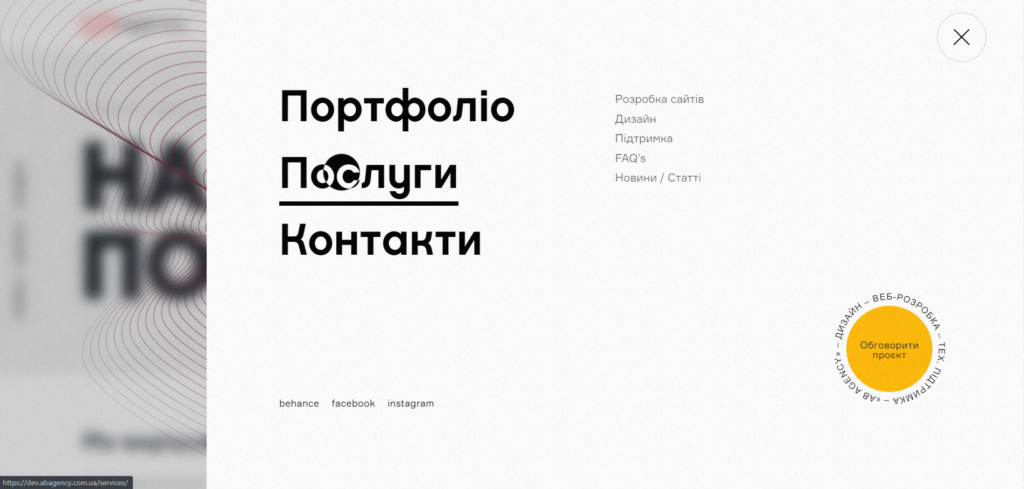
Additionally, the following functions can be built into the menu:
- Call when you click on a phone number or icon;
- Opening pop-up windows with a form;
- Opening mail to send a letter when you click on an icon or email address;
- Opening the second level menu.
- Logo
Put the company’s logo in the menu, which, when clicked, will take the user to the Home page. Users are already used to this scenario, and feel inconvenient when the logo in the header is not clickable.
Thanks to this method, you do not have to develop a separate “Home” item, which saves space. The only thing is that if the age of your audience is 45-50+, you should consider this solution.
- Number of items
If you are designing a classic, open menu, do not try to cram a lot of sections into it, it will be uncomfortable and look overloaded. In this case, use a burger menu. The optimal number of items in a horizontal menu is 5-7.
- Priority
Arrange objects in the menu based on hierarchy. Remember that users will subconsciously read the logic and importance of objects in the foreground or larger in size.
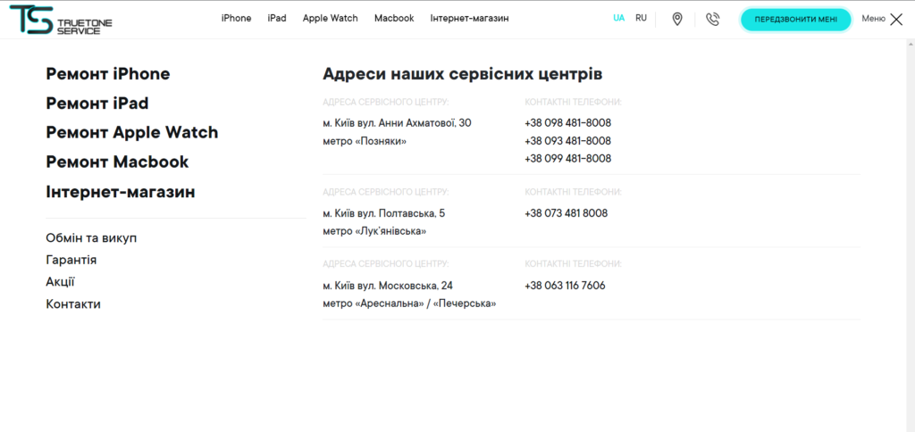
- Size
The menu should be as large as possible for any screen, be it a monitor or a user’s phone. The text will be readable, and the clickability of the elements is convenient.
- Icons
You can use graphic elements in the menu, but do not get too carried away. Let’s remember the rule – the items should be clear, which can be difficult in case of hanging a lot of icons.
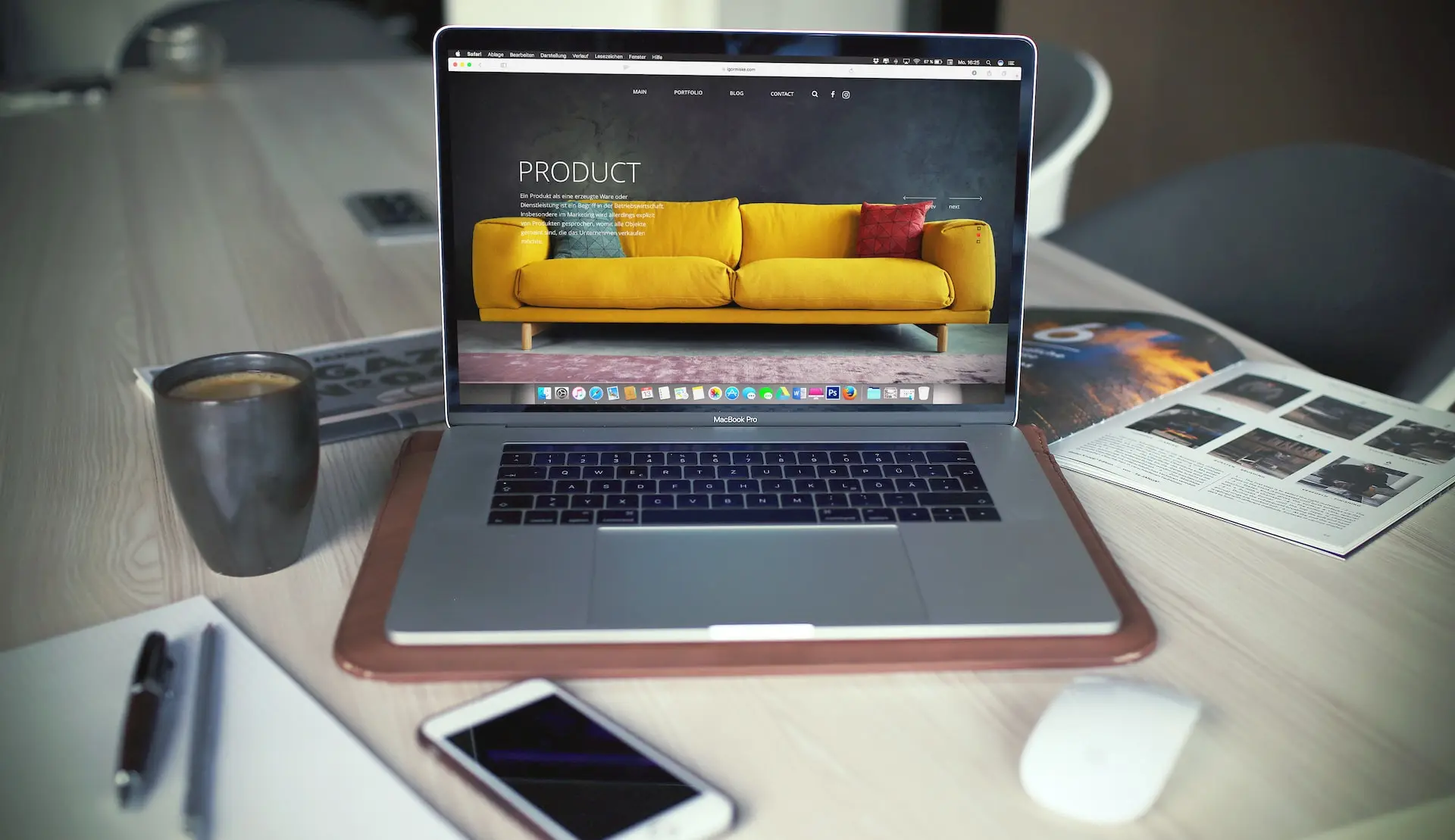
The classic horizontal menu is the most commonly used navigation method. Users are used to this visual, so this option suits most sites.
The disadvantage of such a solution is the limited number of items: only 5-7 categories can be made publicly available, in a larger number the menu will look overloaded and uncomfortable to use.
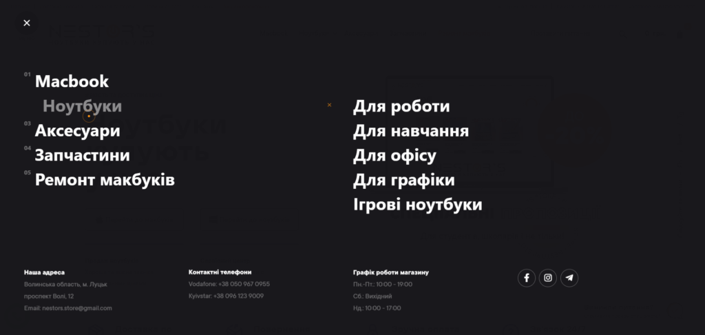
If there are drop-down lists in the menu, be sure to display it visually. Do not use a lot of drop-down lists: if you need complex navigation, divide the categories into levels or use another menu.

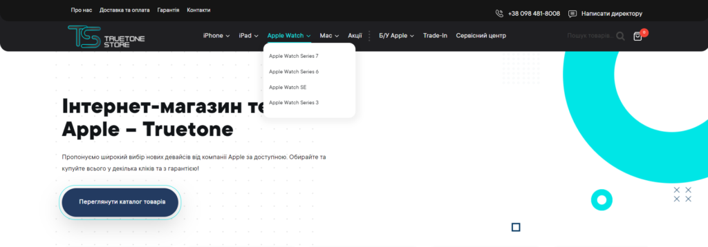
It differs from the classic static only in that it scrolls when scrolling the page. Use a fixed menu if the page of the site is very long, so that the user does not have to turn the mouse wheel to get back to the beginning and go to another section, it’s annoying, isn’t it?)
Or scroll the page to the starting point with one press of the ↑ button.
This technology is quite rare, but also in demand for:
- Development of the main menu and for the personal account;
- Development of an additional menu for easy navigation.

Breadcrumbs
Navigation chains are used on multi-page websites, portals, online stores for additional comfortable navigation. Breadcrumbs look like a line with links to all previous sections that led the user to the current page.
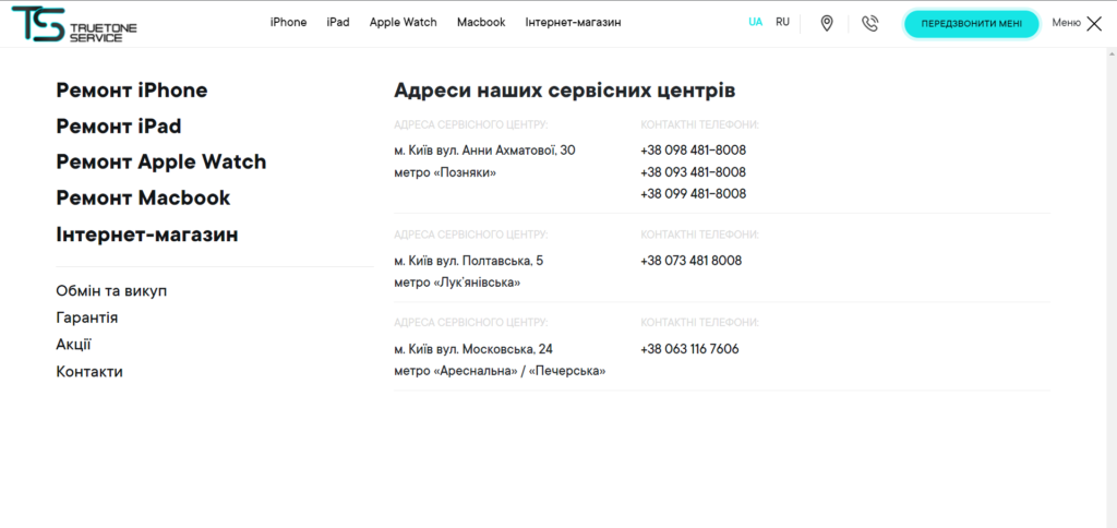
Mega-menu works on the following principle: the main section (menu item) is nested in the usual menu of the second level, with subdivisions and sub-subdivisions. In the niche of logistics or auto parts it is just a must-have.
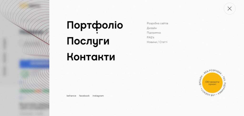
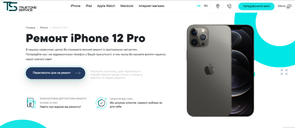
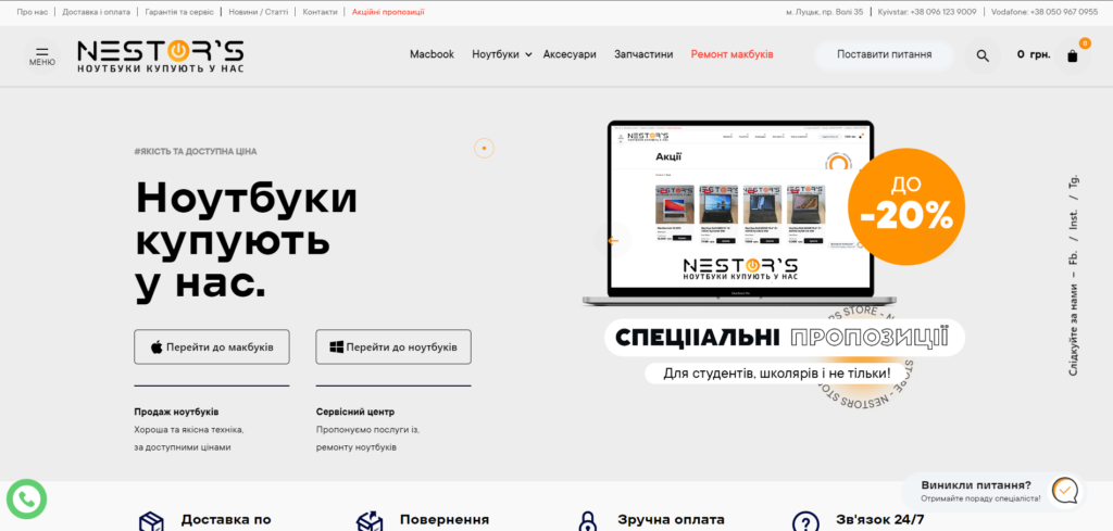
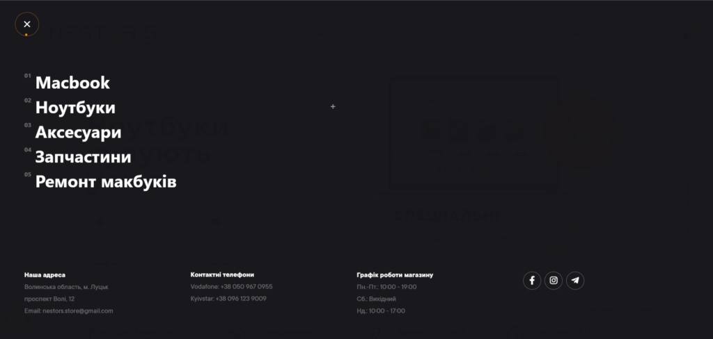
A menu that is called by clicking on an icon, usually consisting of 3 horizontal lines. Users have long been used to seeing it on mobile devices, but now the burger is often found on the desktop. This solution has its pros and cons: on the one hand, the burger gives more opportunities and fewer restrictions in terms of design, on the other hand, not every target audience will understand what it is and how to use it.
If you want to use a burger menu on desktops, think logically: always ask yourself – how will it help the user and can it be limited to the standard horizontal one? If the answer is yes, use a more familiar navigation implementation for users.
- Using split screens for navigation
A trend that came to us from the west and looks very aesthetically pleasing. Translated from English, Split Screen is the division of screens, that is, it is a configuration when the designer intends to divide the screen into 2 or more parts.
This method helps with ease of navigation, increases interest in learning content and encourages users to click on buttons.
The conclusion
So when designing a menu, remember: the priority is user convenience and fast navigation. No matter how cool the menu is, if the user has difficulties with navigation, the value of this design element is zero.